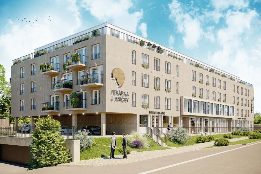
31/05/2024
GARTAL has changed visual identity
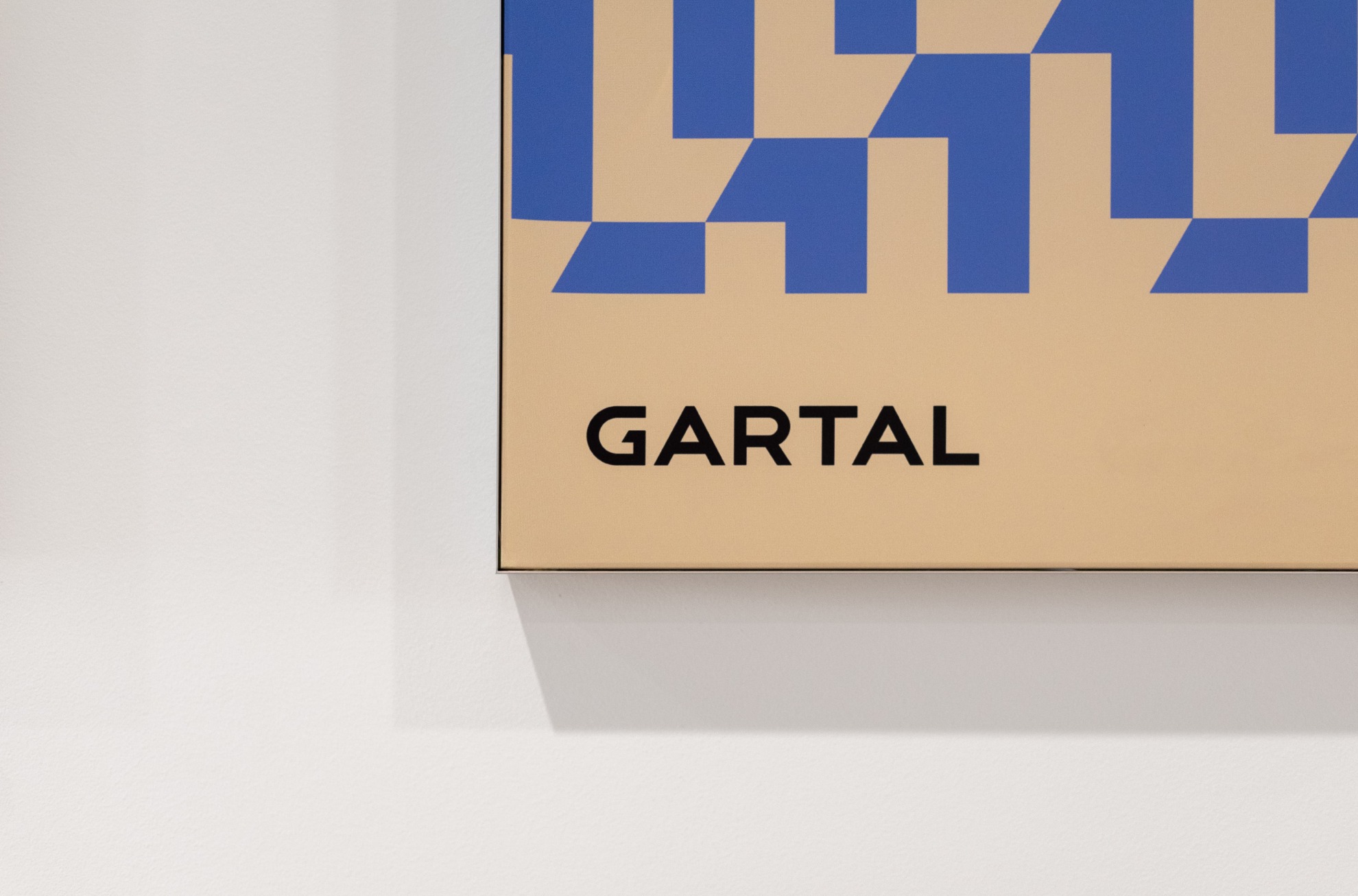
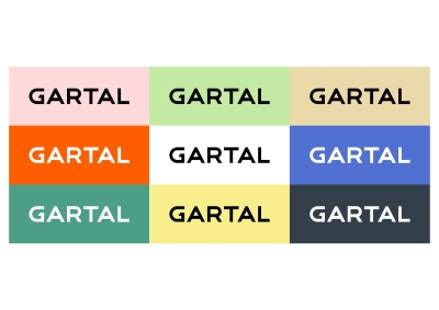
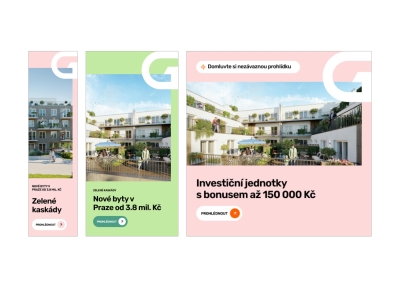
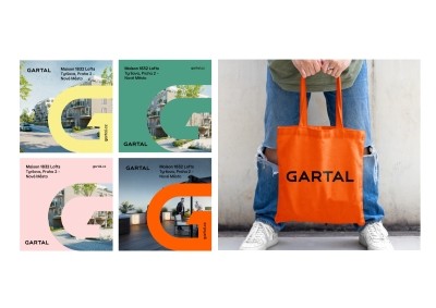
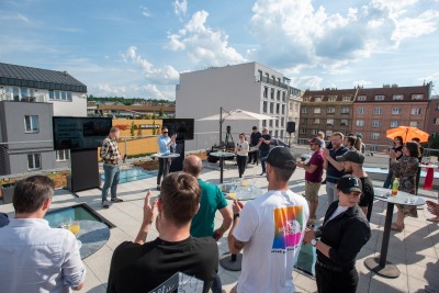
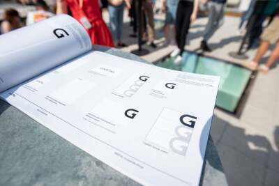
At the end of May, the GARTAL development group changed its visual design and logo. The new style is based on simplicity, lightness and flexibility. The image of the building has disappeared from the logo, the letters have been tightened up and the letter G has become the key communication element. Now 8 are available and will be used to identify the products and services of the entire group. For more information on the new visual identity, please visit our Blog.
